Child Mortality Rates In 0-5 Year Olds
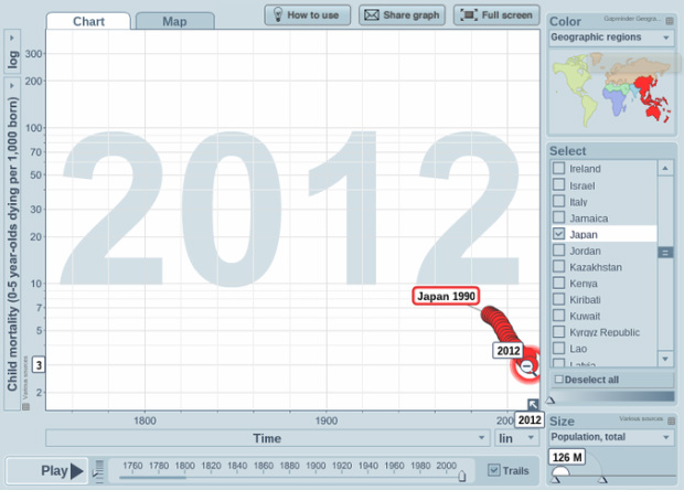
This chart here is on Child Mortality Rates. So the number of kids under the age of 5 that die, per 1000 kids. As we can see here in 1990, the average amount of children dead was 6. Over the years, the rate of deaths has decreased, by 50%. In 2012, the rate had dropped 3 deaths. Which, is actually really good. Sure, 0 would be perfect, but they're not that far off. The 4th Millennium Development Goal is to reduce Child Mortality Rates by 2 thirds from 1990 - 2015; and so far, they're doing a pretty good job. They are only 1 death away from reaching the goal.
CO2 Emissions (Tonnes Per Person) and Energy Use. (Total)

This chart here represents the CO2 (Carbon Dioxide) emissions tonnes per person, and energy use total. Japan's CO2 emissions started off at 2 tonnes per person in 1960. Over the years, it escalated quickly and at one point, (around 2000) was at 10.5 tonnes per person! However after that, it just circled around itself and ended up on 9.3 tonnes. As for energy, that started around 150 million watts, and over the years it slowly, but surely elevated. In 2012 the total was 458 million watts, total. In 2000 (similarly with CO2) it went up to nearly 500 MILLION watts, or half a billion.
Income Per Person

In this graph/chart here we can see that, over time, the average income per person has gone up. In 1950 the average income was around $3,000. Over the years the average income has gone up by about 10 times. In 2011 the average income was $30,593 , which is 10 times more than that in 1950, at $3,000. From 1950 to 1970, the average income rapidly increased, until it slowly calmed down and settled in 1990. From then on the average income has slowly increased.
